Each individual has a limited perspective, and consequently many things appear to the individual to have no order. Statistical ideas allow one to learn, in a principled manner, about a larger part of the collective picture, thus exposing some of the underlying structure and making sense of the world.
That’s from the artist statement of Gregory J. Matthews, assistant professor of statistics at Loyola University in Chicago. Alongside data visualisations, he also makes data inspired art, like the piece Chess Immortal Game above.
Here are some more:


I was fascinated by these pieces when I saw them on the R Graph Gallery, and emailed Gregory to get a bit more background on them. Without wanting to over-explain the art, I was interested to know a bit more about the process.
He said:
Each of these prints is generated from the first 50 (or so) moves of a famous game of chess. Each move is assigned a polygon based on the piece involved and moves are layered on top of each other until the end of the game (or I decide I want to stop layering moves….).
Black pieces generate transparent dark shades, and white pieces generate light shades. Diagonal moves create diagonal shapes, and straight ones generate rectangles (it’s possible to pick out the pawns for example, the thin vertical lines that advance up and down the board). Moves overlap and layer, creating a sense of the areas of conflict and calm.
While they’re based on the ‘data’ of the chess game, they also capture some of the game’s more unquantifiable qualities – its quiet meditative order, and the harmonies of its shape and flow. They create a sense of the underlying structure of the game.
This is the soft border zone between data visualisation and art, where the aesthetic and storytelling qualities of visualisation begin to push the data into the background, without ever removing it. But there’s nothing over-designed about these works, they’re just good ideas, simply and well executed.
That’s also true with Matthews’ Google Location Data pieces.
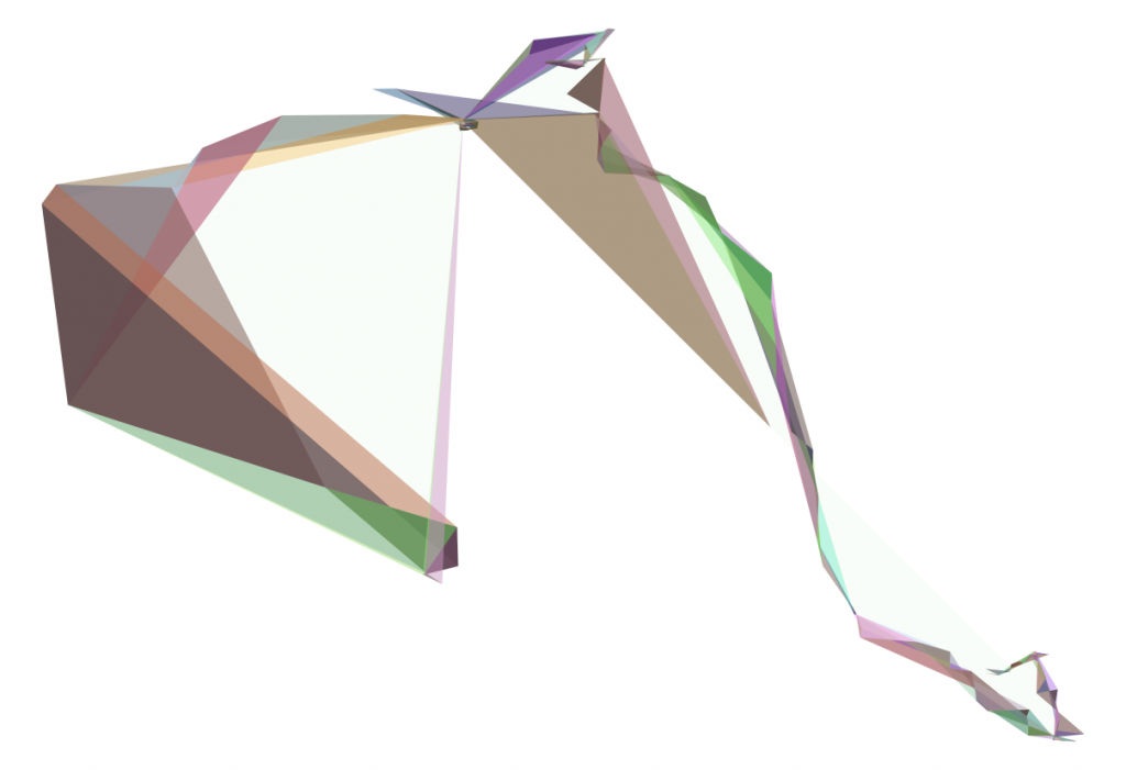
Google Location Data (2016)
As he describes the process of making these:
Each image is a single day of my life. I take the coordinates of where I was during that day and create triangles by moving through the day in groups of three points (sort of like a moving average).
A triangle is formed from the latest location point and the two preceding recorded points, progressing throughout the day. It’s possible to see the ‘shape’ of every day, whether it involved a long round journey, a hectic back-and-forth, or an orderly movement along the grid defined by an urban landscape.


Of course it would be possible (even more ‘accurate’ in a sense) to draw a simple line that connects the data points. But that would lose something of the insight that these works have – that each day is an interesting object, a journey of experience as much as a path through space. The coloured triangles suggest the different qualities of mood and light throughout the day, like vignettes, with views that are arcing and expansive or busy and constrained. (I do wish the colours also held a secret meaning, Matthews also says he’d like to give the colours some signifying value in a later iteration of the work).
Just to make an even three, here’s another one of Matthews’ works:
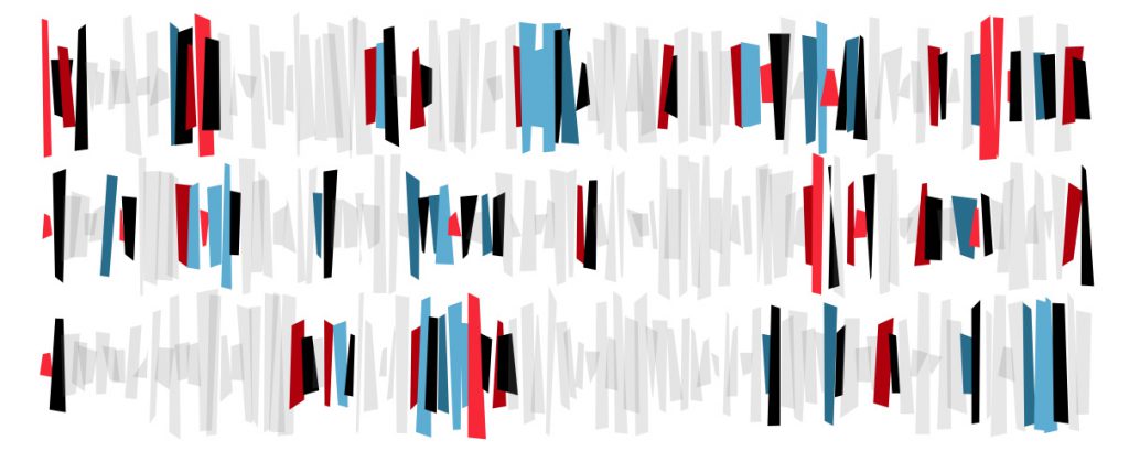
Craps (2013)
It’s based on the game craps, and simulates a series of dice rolls visually. If you want to know the details, Matthews writes:
Each of the three rows corresponds to a string of rolls in the game. The height of the quadrilateral represents the total of the two dice on a given roll whereas the color corresponds to the outcome of each roll. Red shades are losses, blue shades are wins, black is setting the point, and gray is where no win or loss occurs. Lighter shades of blue and red correspond to wins and losses, respectively, on the come out roll as opposed to wins or losses by hitting or missing the point. Random noise is added to each rectangle to represent the human element in generating these numbers through a human rolling the dice.
I love the playful rhythm of this one, an interesting contrast to the chess pieces. It has a kind of jangling street-game quality to it (which is what craps is), unlike the sombreness of the chess boards.
—
Matthews’ works remind me that the aims of data visualisation and art aren’t polar opposites. If art tends to focus on understanding the unquantifiable and ambiguous parts of our world, and data visualisation the quantifiable and didactic, that doesn’t mean that these borders are hard and fast. To understand the world to any degree we need both, in different situations and to greater and lesser extents. Matthews likes to say that ‘data visualization answers a question, and (good) data art asks a question’.
I like to see the Google Location pieces as a kind of ‘self portrait’ on a given day. Seeing data visualisations as portraits, or ‘historical paintings’ in this way positions us within the wider field of meaning-making and understanding the world – within which data visualisation is a smaller piece carved out by language, culture and the needs of the day.
You can see more of Matthews’ work on the R Graph Gallery and his website, Stats in the Wild. He also organises the annual JSM Data Art Show. It’s getting late to submit this year (though if you really want to, there’s still time). He also has an Etsy store and a Threadless store.
—
Have a question for Small Multiples? Want to work with us (or for us?)
get in contact.