The Kantar Information is Beautiful Awards is a highly recognised award for outstanding projects in the field of data visualisation. Two of our projects made it onto the long list this year: Our chocolate project Not a Single Origin and our iOS App Hello, Sun. The overall winners will be announced in New York tonight.
We had a close look at all shortlisted projects and found some that were inspiring to us. Scroll down to have look at our top choices.
Most beautiful
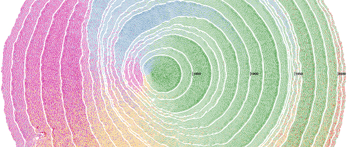
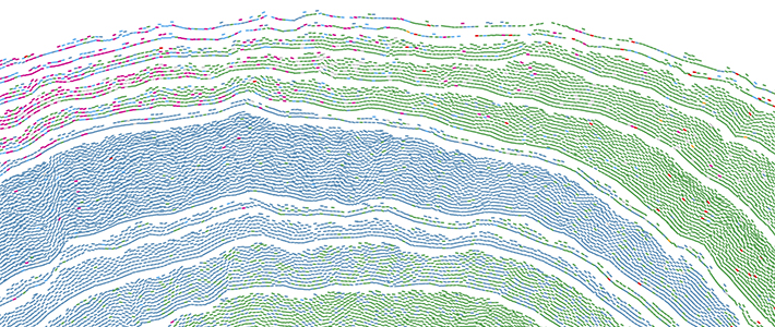
We are amazed by the project Simulated Dendrochronology of U.S. Immigration 1790-2016 by National Geographic and Northeastern University. Waves of immigrants colour coded by region of origin are visualised in a static image using dot density and a smart arrangement that resembles the pattern of a tree ring.
The visualisation reveals how big European influence has been since day one. It also illustrates the steady increase of Latin America and Asia immigrants over time, and regions of less immigration frequency, such as the Oceania and Africa.
Not only are the generated visuals very appealing but also the use of the metaphor of tree rings has been beautifully applied to the overall concept. We think it’s one of the most beautiful projects this year.
Most useful
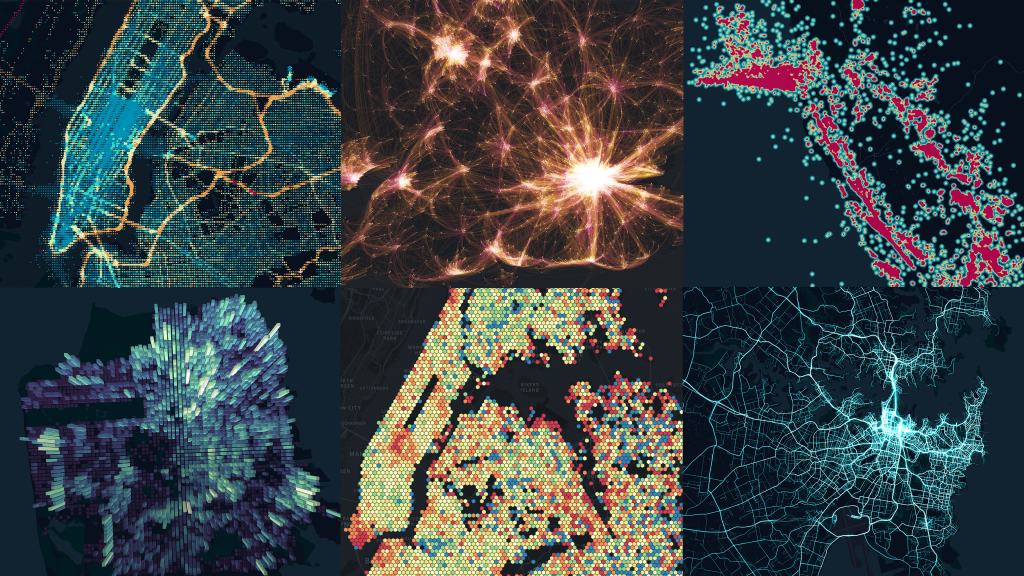
Uber’s release of Kepler.gl, a geosptial analysis tool that runs in a web browser! We’re impressed by its ability to visualise large spatial datasets quickly and interactively. It’s a powerful tool that makes creating beautiful data-driven maps easy, there are a number of map types to choose from.
Making sense of geospatial data is an essential part of our day-to-day work and Kepler.gl has been a very helpful tool in our studio. We think it’s one of the most useful projects this year.
Most social impact
A project that left us speechless was What Happens To The Plastic We Throw Out by National Geographic which communicates the source of plastic that finds its way into the ocean.
The single scroll uses a combination of animated and interactive data visualisations, video animation, photography and explanatory text.
The website gets a strong message across very quickly while keeping the user motivated to scroll until the end. We think it’s one of the projects that leaves the user the most impacted.
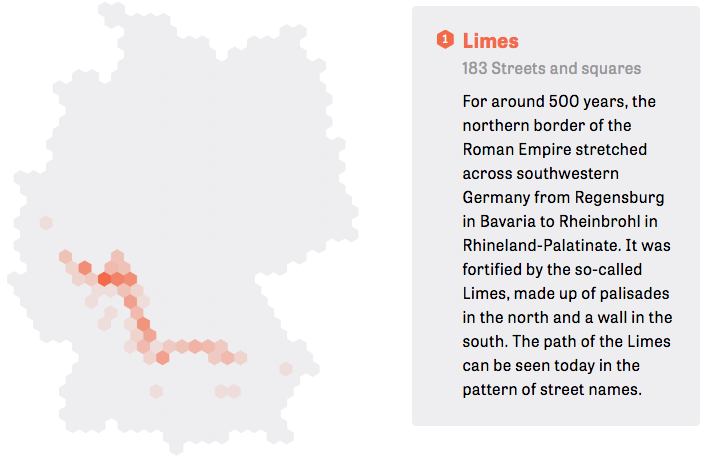
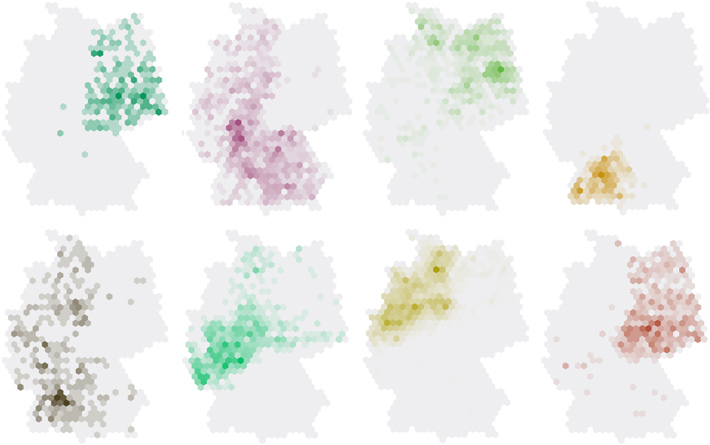
Our favourite
A project with an incredible level of precision in data analysis, user experience and interaction, visual design and journalistic research is Streetscapes – Mozart, Marx and a Dictator by German online newspaper “Zeit ONLINE”. We are very inspired by the overall concept and execution and it has been a favourite of ours since it has been published.
The single page website uses the parallax scrolling effect to highlight patterns of street names in Germany. The street names are grouped into topics such as “historic references” or “regional peculiarities” and every pattern has a small description attached. The final result is a very engaging website that lets the user explore patterns of German street names in a surprisingly fun and informative way.
We think it’s one of the strongest projects this year and a hot candidate to go home with an award.
Let us know what you think about our top picks via twitter @smallmultiples #visualisetoday #IIBAwards