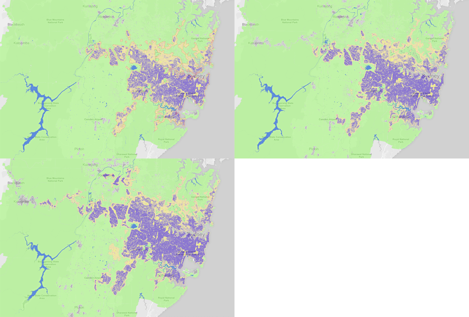
Atlas of Urban Expansion
The NYU Urban Expansion Program monitors the global urban expansion on cities of 100,000 people or more. In addition to being an excellent source of data, the website has a map that shows how the urban extent of these cities have grown in the past decades. I’ve created an animation for Sydney from the map, the result of the property boom is very clear without much explanation.
(Purple = Urban built-up, Yellow = Urban open space, Green = Rural open space)
A colorful π chart
This chart shows that some numbers appear more often than others in pi’s digits. Number 1 seems to be the clear winner except between decimal place 2,000 and 4,000.
The Art of Statistics – Learning from Data. By David SpiegelhalterThe Art of Statistics – Learning from Data. By David Spiegelhalter
In The Art of Statistics, David Spiegelhalter guides the reader through the essential principles we need in order to derive knowledge from data. Drawing on real world problems to introduce conceptual issues, he shows us how statistics can help us determine the luckiest passenger on the Titanic, whether serial killer Harold Shipman could have been caught earlier, and if screening for ovarian cancer is beneficial.


